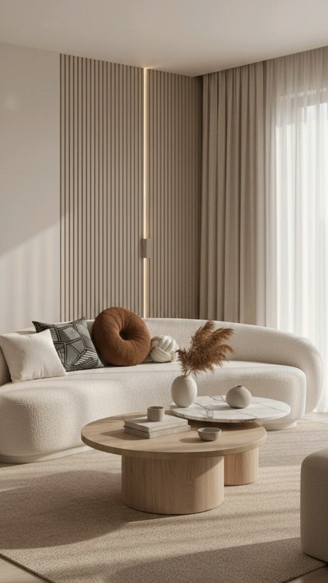
An interior design website has one job before any other: to make the right client feel, within a few seconds, that your studio understands the kind of home they want. Photography carries most of that work. But photography alone rarely turns a visitor into an enquiry. The structure around it, the pages and the order in which they appear, is what moves someone from admiring your work to writing to you.
These are the pages I consider essential when I design a website for an interior design studio, what each one has to do, and what you can safely leave out.
1. Home
The homepage is not a summary of everything you do. It is an introduction to how you see a space. Lead with one or two of your strongest images, a single sentence that says what you design and for whom, and a clear way forward: view the work, or begin a conversation.
A good test: if someone saw only the first screen, would they know whether you design full homes or single rooms, residential or commercial, locally or further afield? If not, the homepage is decorating rather than introducing.
2. Portfolio and individual project pages
Most interior design websites stop at a gallery. The studios that convert visitors into clients go one step further and give each project its own page.
A project page should include:
- The brief in a sentence or two. Who lived there, what they needed, what was not working.
- The space. Location, type of home and the scope of your work.
- The photography, in sequence. Wide shots first, then details, so the visitor walks through the home as a guest would.
- One or two decisions you made. A material, a layout change, a piece of furniture designed for the space. This is where your thinking becomes visible.
Project pages also help you appear in search. A page about a "coastal family home renovation" can be found by someone searching for exactly that, while an unlabelled gallery cannot.
3. Services
Clients rarely know how interior design is offered. Is it full-service? Can they hire you for one room? Do you work with their architect? The services page answers this plainly.
Name each service, describe who it is for, and explain what is included. If you only take on full-service projects, say so: being clear about what you do not offer is as valuable as describing what you do, because it filters out enquiries that would never have fit.
4. Studio or About
Interior design is personal. People are inviting you into their homes, often for months, and the About page is where they decide whether they can imagine working with you.
Include a real photograph of you, the story of how the studio began, and a short statement of your point of view. Keep it in the first person if you work alone. A list of qualifications is useful, but a sentence about how you think about a room will do more.
5. Process
This is the most underrated page on an interior design website. Clients considering a significant investment want to know what happens after they write to you: the first conversation, the concept, the presentation, procurement, installation.
Lay the process out in four to six steps, each with a sentence or two. You do not need to publish fees here, but explaining how you structure the work reduces the uncertainty that stops people from enquiring.
6. Enquire
The contact page should do more than collect a name and email. A short, considered form that asks about the location, the type of project, the scope and the timing helps you prepare for the first conversation and gently discourages enquiries that are not a fit.
Keep it brief. Five or six questions is enough. Add a line about when you will reply, so the client knows the message has not disappeared.
7. Journal or press (optional)
A journal is not essential at launch, but it becomes valuable over time. Articles about how you approached a kitchen, how to choose stone, or what to expect from a full renovation answer the questions your future clients are already searching for, and they give Google more reasons to show your studio.
If you have been featured in publications, a simple press page with the covers and links builds trust quickly.
What to leave out
- Sliders on the homepage. They hide most of your images and slow the page.
- Long lists of every service you could possibly offer. Focus on what you want more of.
- Stock photography. Clients can tell, and it undermines the work that is genuinely yours.
- Pop-ups the moment someone arrives. A visitor who has not yet seen your work has no reason to sign up for anything.
A quick checklist
Before you launch or redesign, check that your website has:
- A homepage that says what you design and for whom in one sentence
- At least three projects with their own pages and short narratives
- A services page that names what you offer and who it is for
- An about page with a real photograph of you
- A clear process in four to six steps
- An enquiry form that asks about location, scope and timing
- A page title and description for every page, written for the clients you want
If several of these are missing, the website is probably costing you enquiries that your portfolio has already earned.