AURA Interior
A single continuous-line monogram sealed inside an oval, weighted so the mark behaves like a maker's stamp. The system extends into stationery, a portfolio box and a restrained cocoa and bone palette.
Identity systems and digital design across interiors, wellness, fashion, architecture, fragrance and lifestyle, each developed from positioning through to a complete visual language.
A single continuous-line monogram sealed inside an oval, weighted so the mark behaves like a maker's stamp. The system extends into stationery, a portfolio box and a restrained cocoa and bone palette.
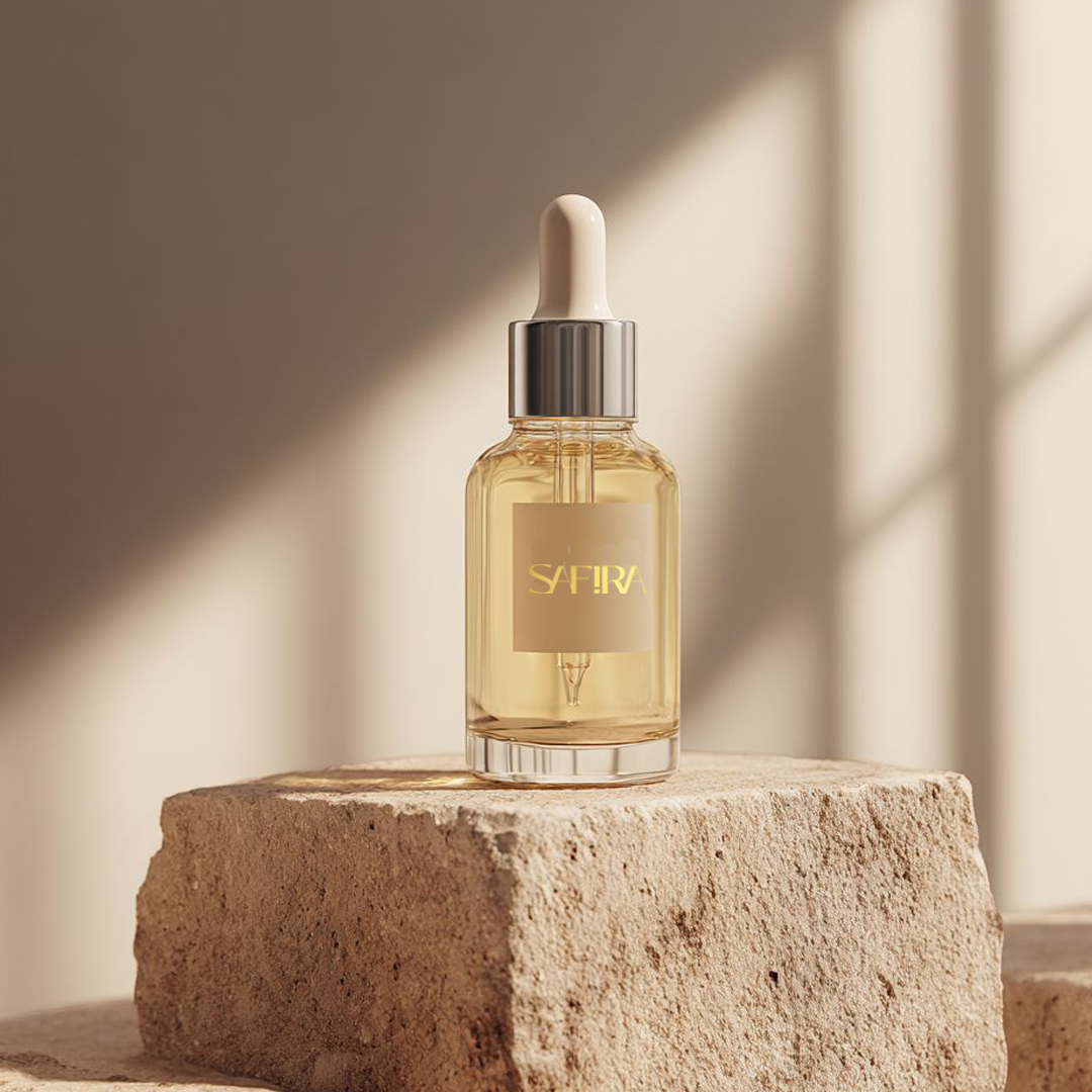
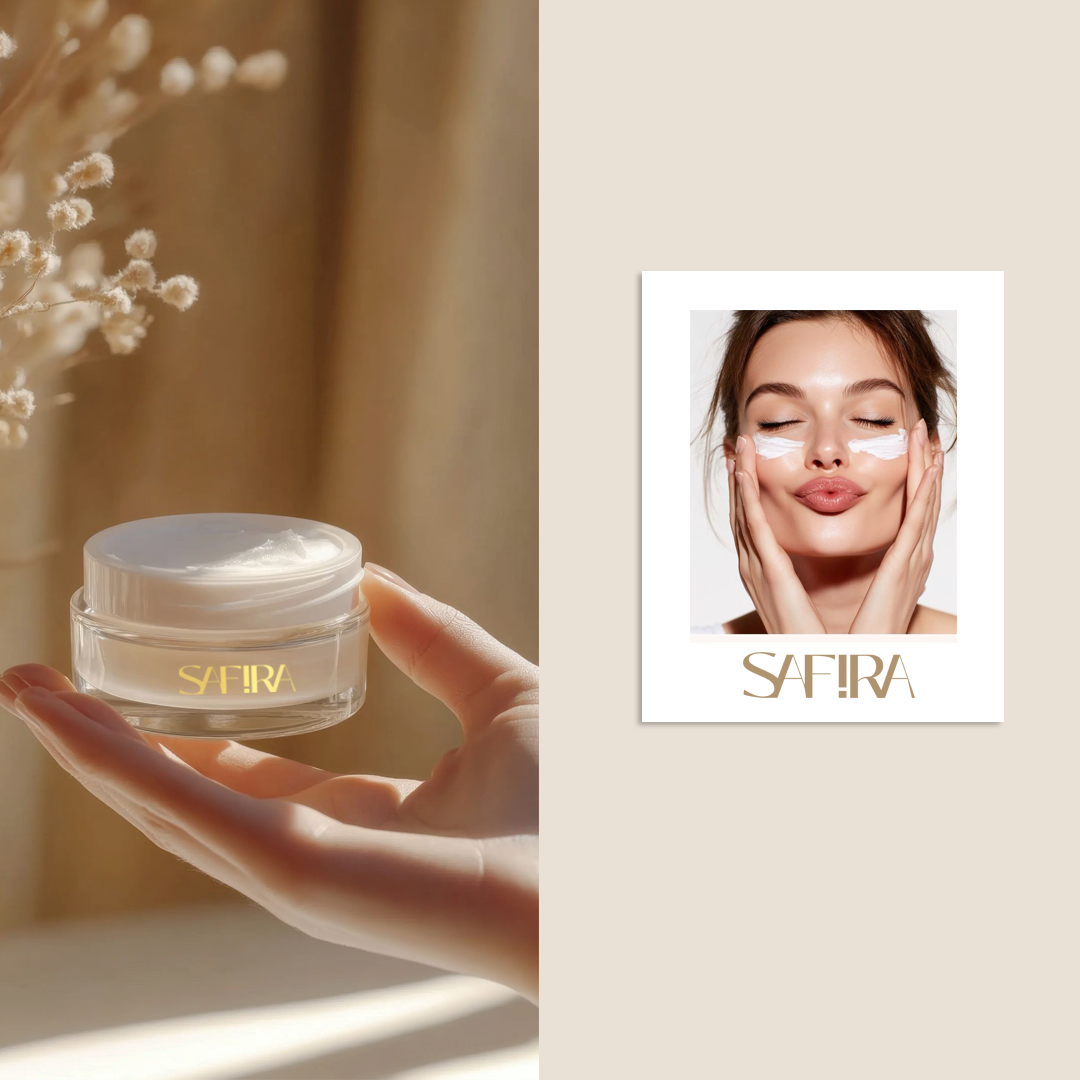
One typographic decision carries the brand: the exclamation mark standing in for the letter I, set in gold and repeated across dropper, jar and campaign.
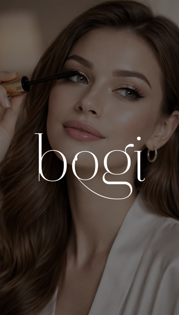
The tail of the g carries under the whole word like a single stroke of liner, drawn with enough weight to sit directly on editorial photography without a plate behind it.
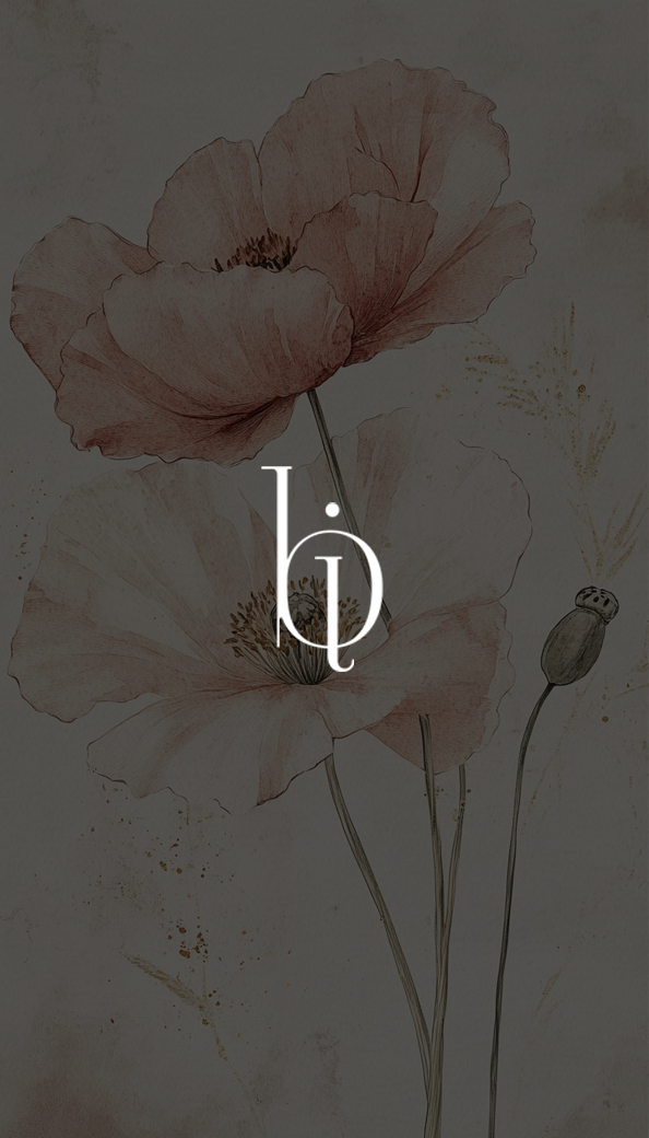
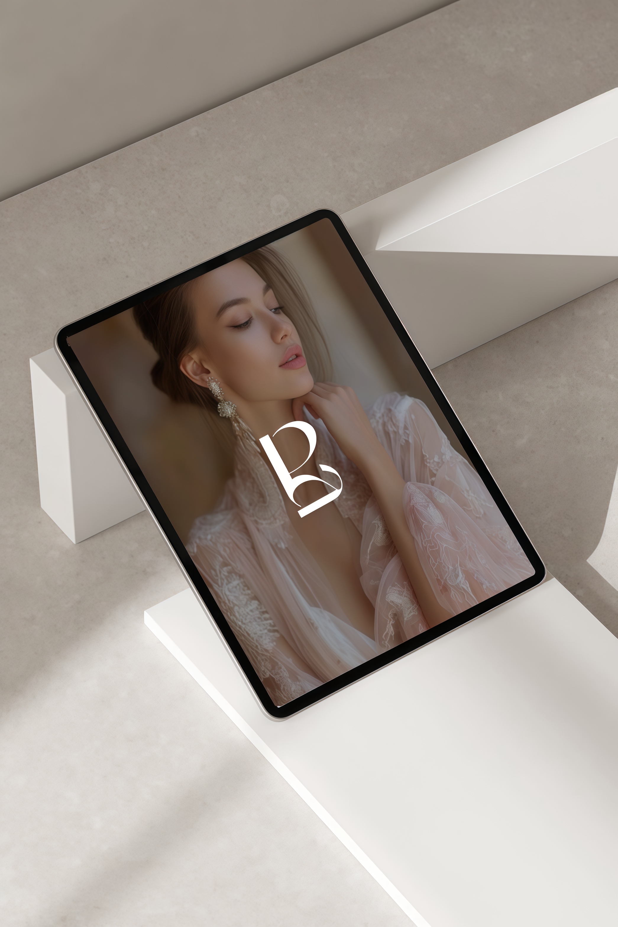
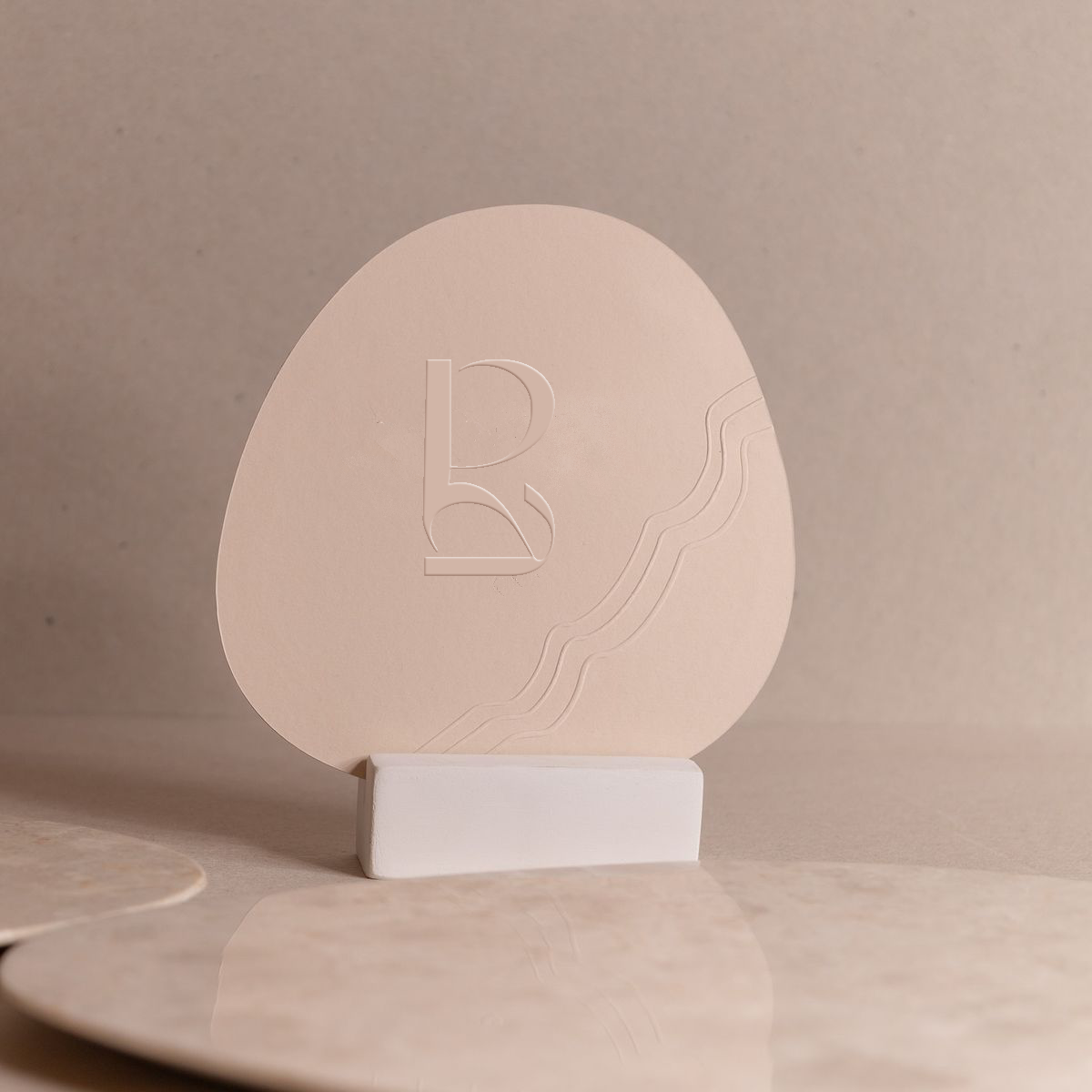
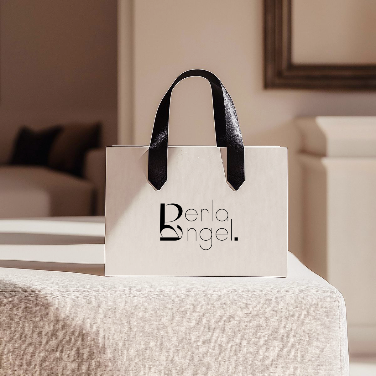
A name that reverses on itself, set as a mirrored pair so the reflection is the logo. Stroke weight tuned for an emboss, where the mark is carried by shadow alone. The system extends to a website and editorial layouts.
A ligature monogram where M and A share a single stroke, built to sit quietly over the studio's own interior photography rather than compete with it.
A signature designed to print directly onto glass in rose gold, so the name floats over the juice rather than sitting on a label.
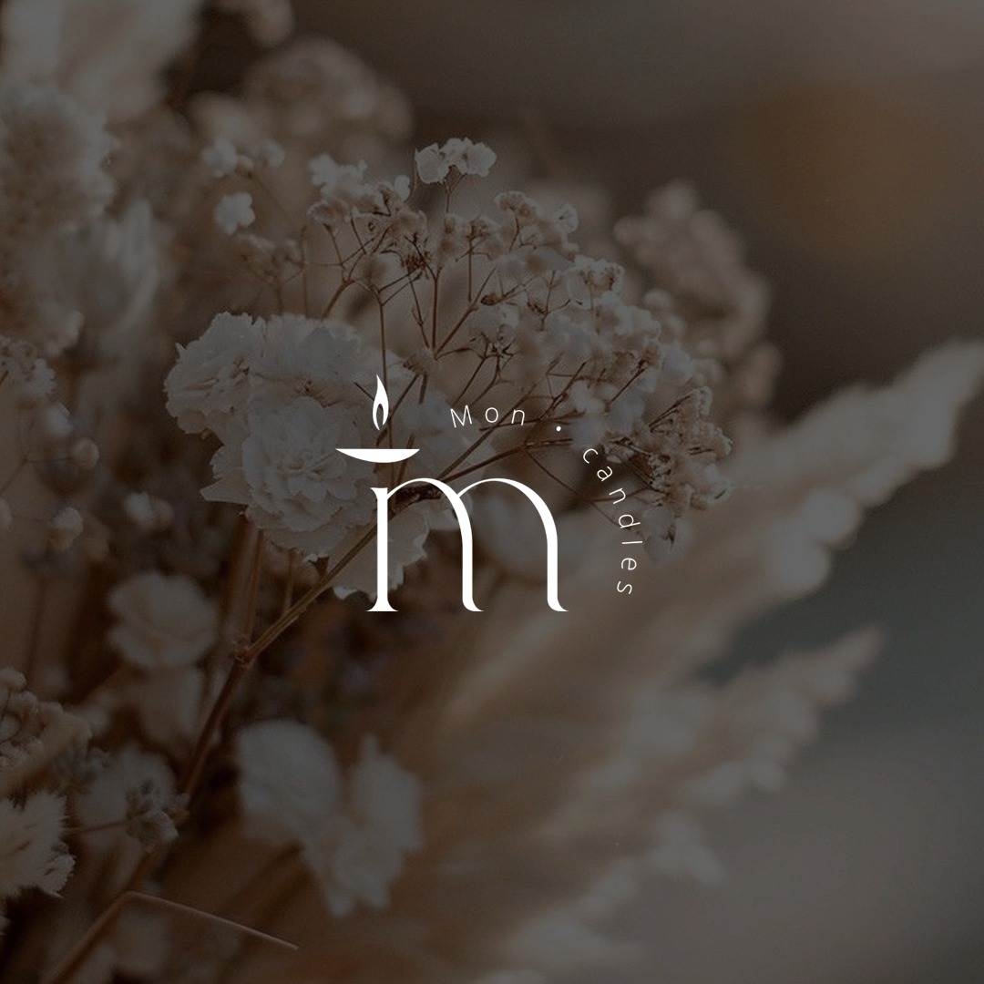
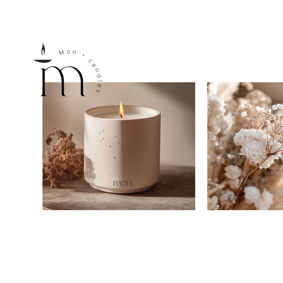
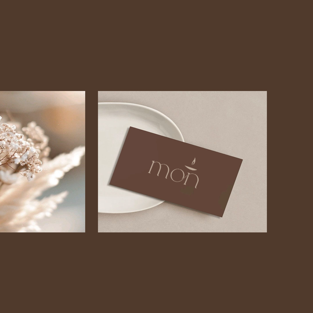
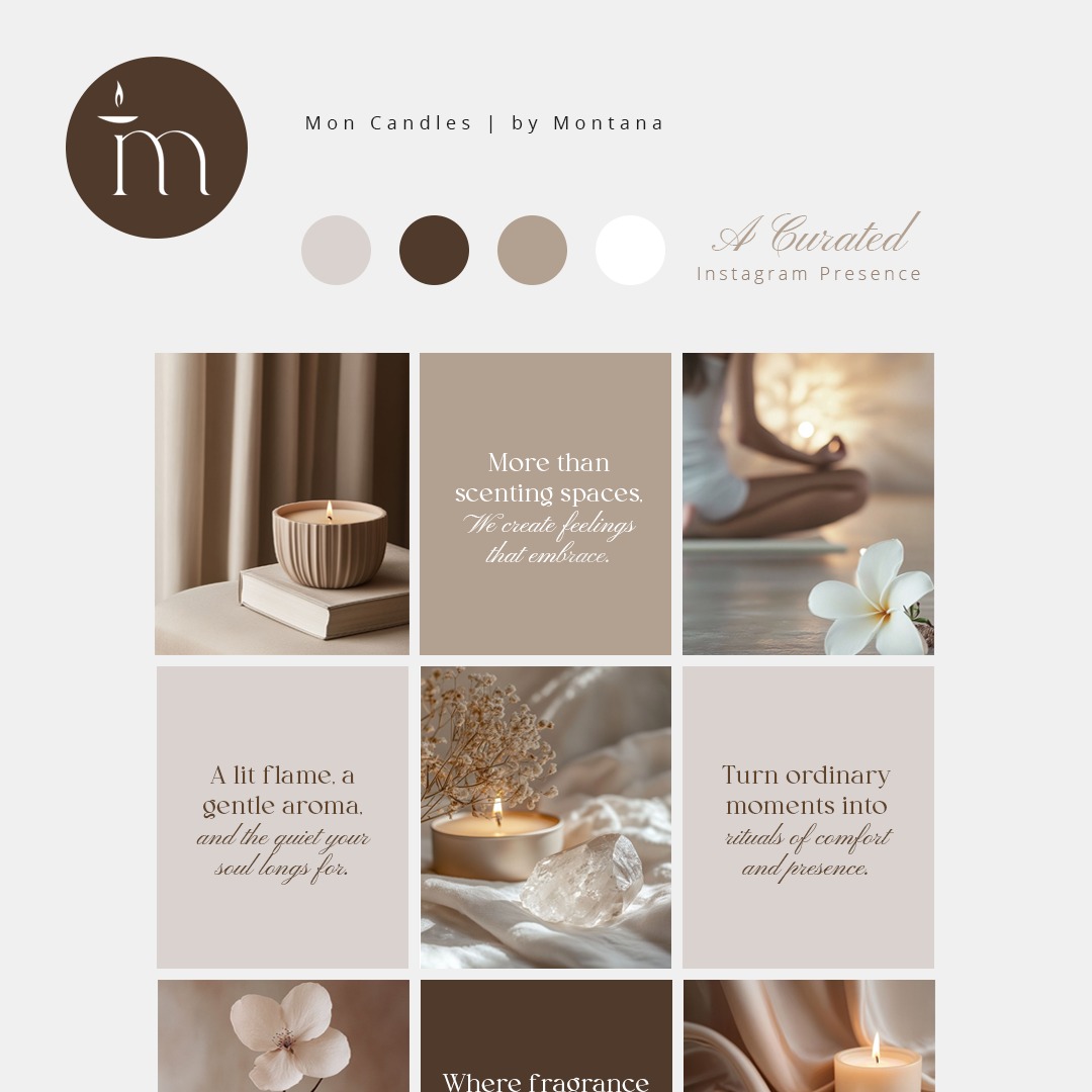
The letter m became the vessel with a flame set above it, so the mark is the product. A content system followed, with a rhythm the owner can run without a designer.